Kenyon Geetings
Professor Erik Insko
DATA-310 Data Visualization
11 November 2023
Design Project Plan
Intended Data Source:
https://www.kaggle.com/datasets/williamschooleman/scoobydoo-complete/ which contains every Scooby-Doo episode and movie’s various variables.
Questions I plan to explore:
Preliminary ideas for visualizations:
Kenyon Geetings
Professor Erik Insko
DATA-310 Data Visualization
3 December 2023
Design Project Final
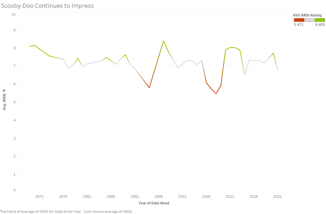
For this first graphic, I just wanted to quickly see how well rated Scooby-Doo was over the entire time. I was expecting more drops in ratings over time, but it seems that overall Scooby-Doo has stayed pretty consistent to what the viewers want.
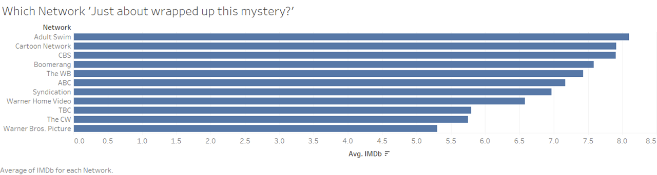
This graphic is a continuation of the last one where I wanted to explore which network did the best job of making Scooby-Doo content. I’m glad to see Cartoon Network and CBS at the top, since they have by far my favorite series and movies.
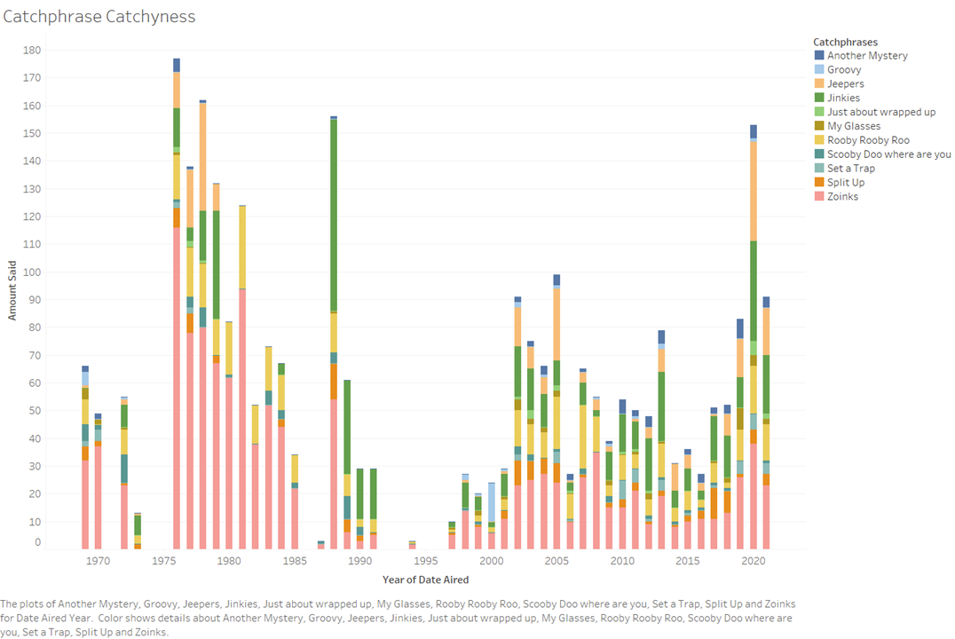
Since I had the data, I knew that taking a look at how often each catchphrase was said was going to be fun to look at. I then got the idea to take a look at how often the catchphrases were said over time, which allowed for a more exciting stacked bar chart.
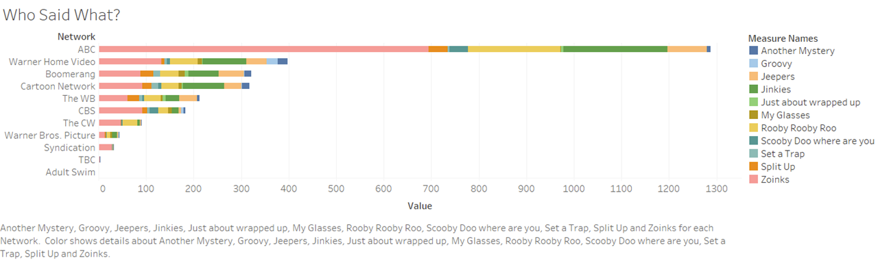
This graphic is a continuation of the last, where I wanted to see which networks stayed true to using the classic catchphrases. I do think this graph is useful but I do realize that ABC’s incredible amount of catchphrases does make the other networks harder to see.
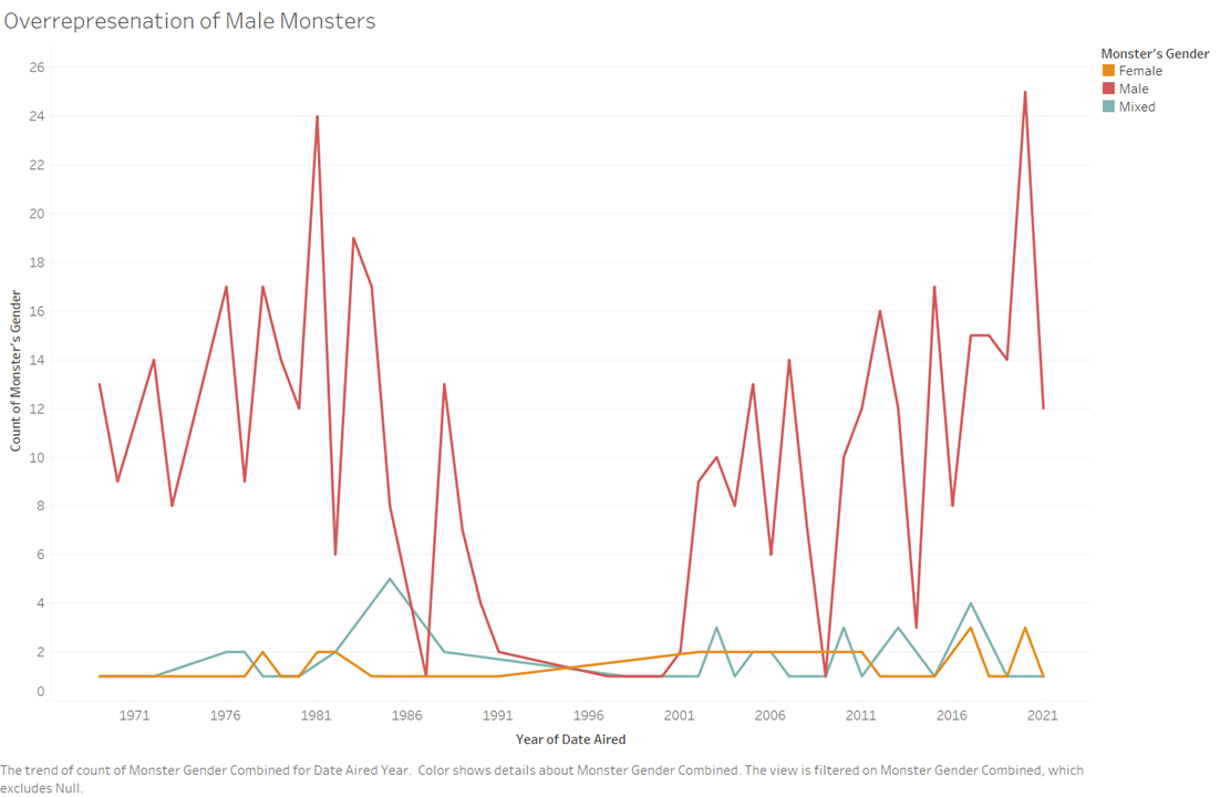
I’ve always wondered how little representation women got as being the monsters in these shows, but I was surprised by simply just how little representation they have.
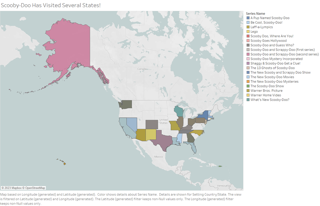
This graphic shows where Scooby-Doo has been over the US, sadly, Iowa has not been one of them.
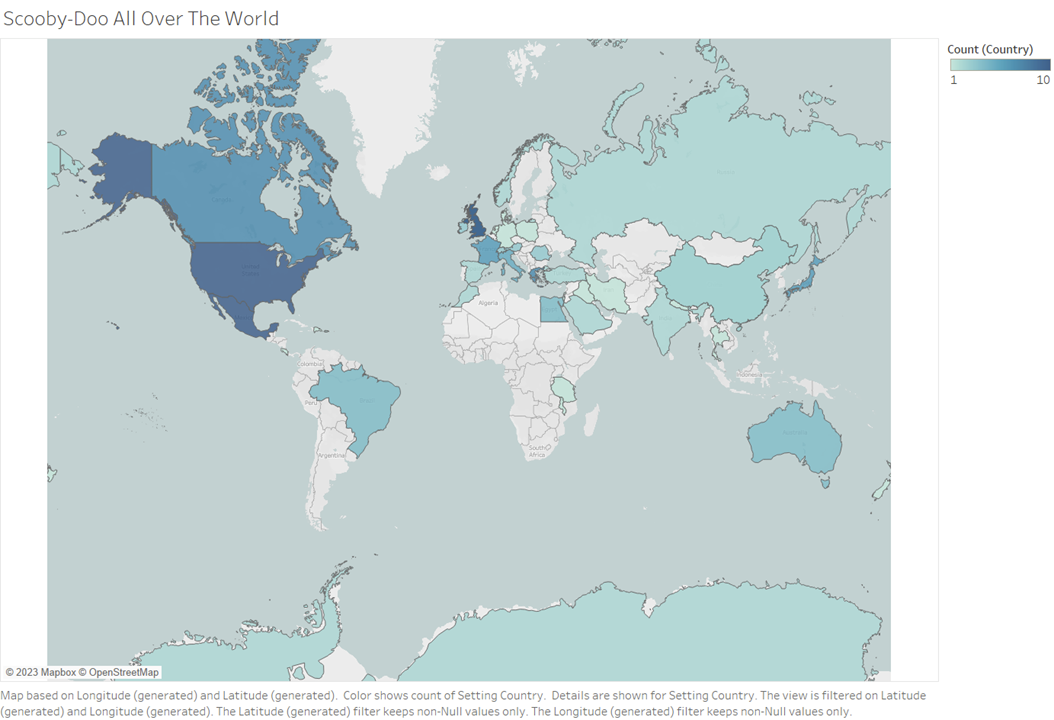
This graphic is a continuation of the previous graphic, but instead shows how often Scooby-Doo visited places throughout the world. I had to remove some entries for places like Atlantis as I don’t believe we’ve discovered exactly where that is yet!
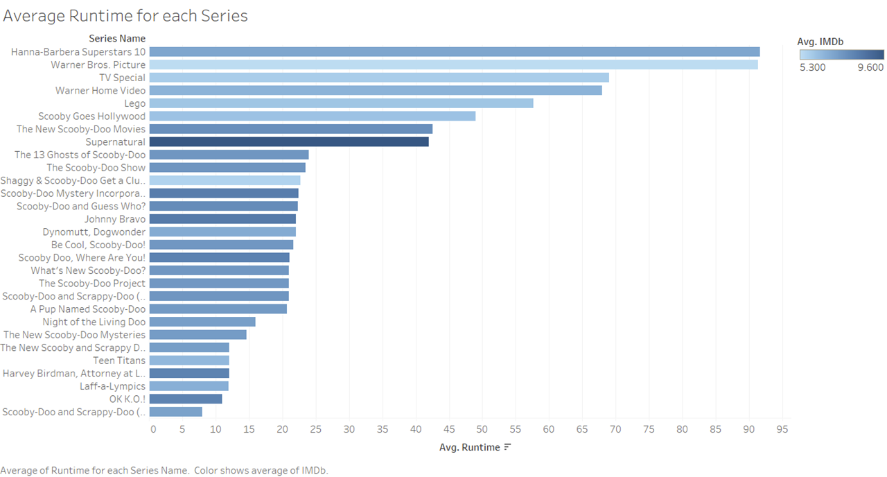
This visual was made in hopes to find a correlation between the IMDb rating and the average runtime of the series. While I don’t think I found a really good correlation, it was interesting to see that most of the movies got worse ratings than most of the shows.
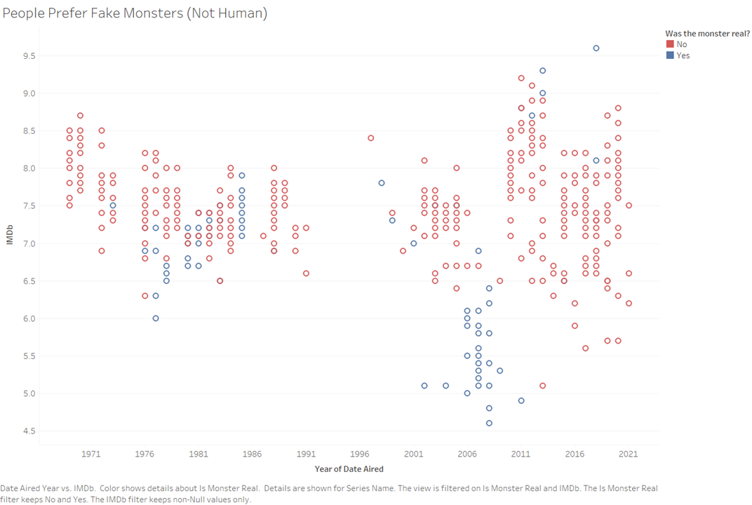
This is honestly one of my favorite visualizations as it clearly shows that people generally prefer fake monsters in a way that is colorful and busy, but also very simple to read and understand.
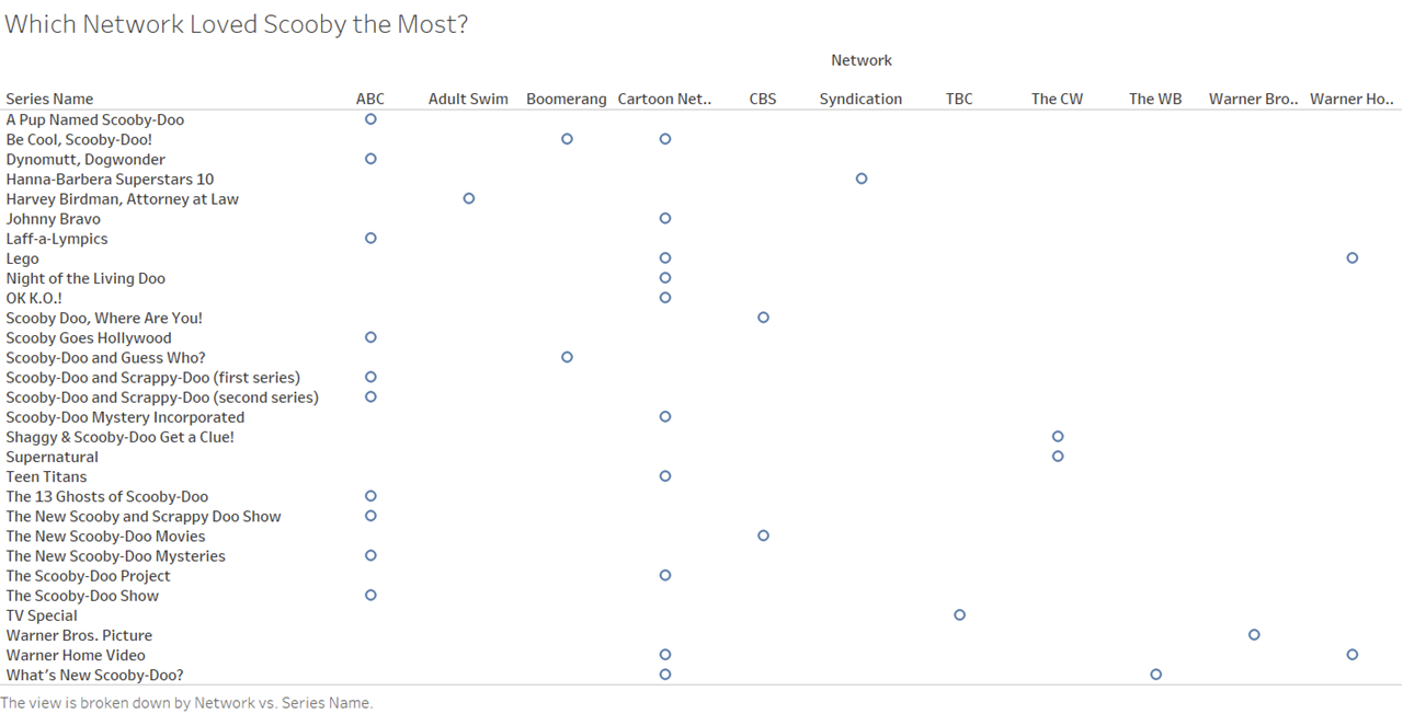
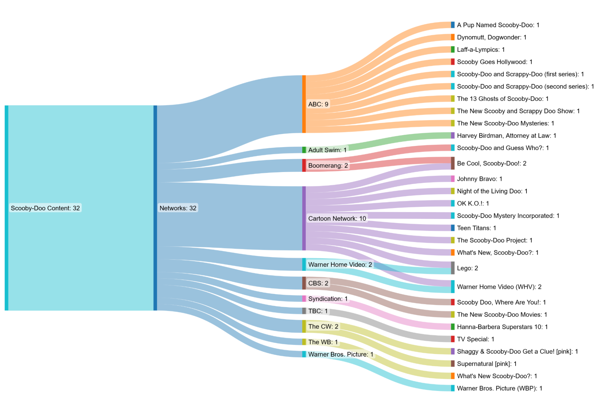
These two visualizations build upon one another. The first is just a table where each network is plotted on a table against what shows they did. I really didn’t like this table look, so I went on to create a Sankey diagram that better shows the breakdown of where Scooby is seen the most. This is probably my favorite graphic as it’s colorful, fun to look at, and very easy to understand.