Kenyon Geetings
Professor Erik Insko
DATA-310 Data Visualization
11 October 2023
Design 2
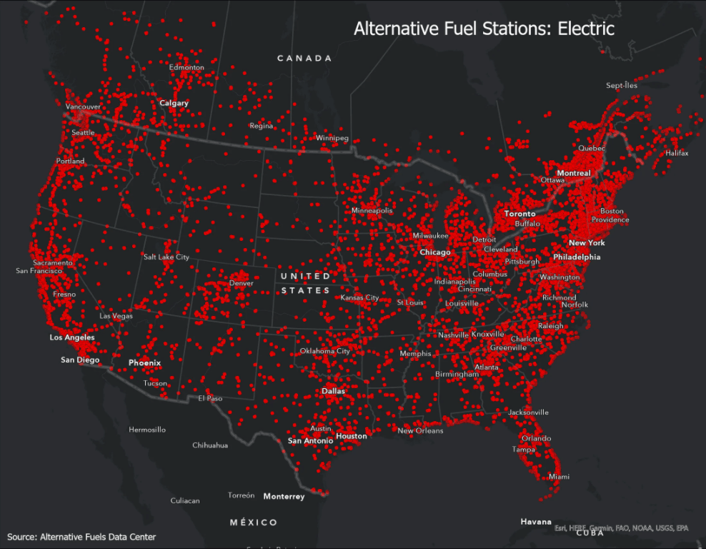
|
Original |
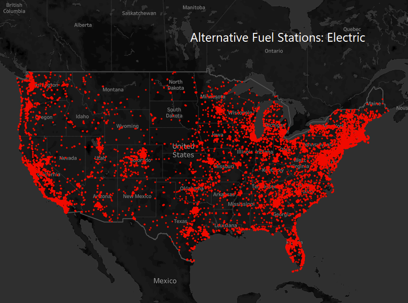
Recreation |
|
|
|
I attempted to recreate a map visualization of electric fuel stations in the United States. The original graphic is found here: https://wonderingmaps.com/us-alternative-fuel/. I found public data available here: https://catalog.data.gov/dataset/alternative-fueling-station-locations-422f2.
One of the difficulties I encountered with recreating the original was finding up to date data. I ended up finding a file for 2021 data, but it only included the United States, not Canada like the original. Another problem I faced was trying to figure out how to get rid of the State names and only show the larger city names like the original chose to do. I discovered this option within the map’s background layers, but when using Tableau, city names are only visible when you zoom in. Consequently, if I wished to capture a screenshot of the entire United States, I had to forgo displaying city names. I also did not encounter any way to change the spatial projection in order to add “curve” to the visualization. Overall though, this “map and dot” visualization was fun to recreate, and I am happy with how my version turned out.